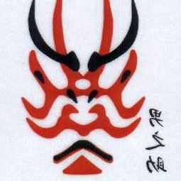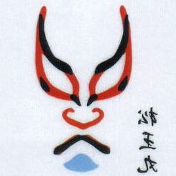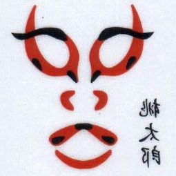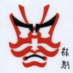


Master school graphic design project of a poster for a kabuki theatrical show.
Rather than using real photos, the graphics come out of a vectorial stylization of one of the kabuki masks used during the performance, thus giving somehow a “pop” taste to a very traditional Japanese theatrical art. Following this lead, the typographic font used for the title aims to draw a parallelism with “The Kiss” rock band’s main visual themes, knowingly inspired from the art of kabuki. The emphasized dimension of the mask and its half-cut aim to catch attention and intrigue; the predominant use of whites and reds are a tribute to the institutional colors of the Japanese flag.
